About our name and logo
Where our name came from, and how the logo took shape.
About the name
Our name is a Cantonese pun: 好橘子, “a fine mandarin orange”, is read hou2 gwat1 zi2 — exactly like 好骨子, praise for things refined, graceful, just right. And we write it with 橘 for tachibana, the evergreen citrus native to old Japan, long a symbol of what endures.
About the logo
Our logo is drawn from life: a warbling white-eye — mejiro — we met on a Kyoto roadside. We are birdwatchers, which is why we stopped at all.
In our language-school days, the daily walk ran between Karasuma-Oike and Marutamachi. One morning after rain, a mandarin lay by the gutter’s edge. A mejiro came down to it and, glancing about between pecks, ate with complete devotion.
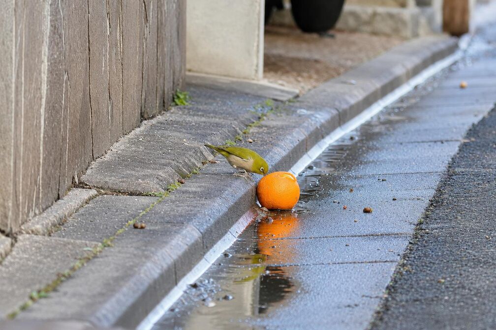
We stood and watched for a long while. Small, light, wholly given to the one bright thing in front of it — finding something good and savouring it properly. It looked like the way we wanted to work. Those photographs are where the logo begins.
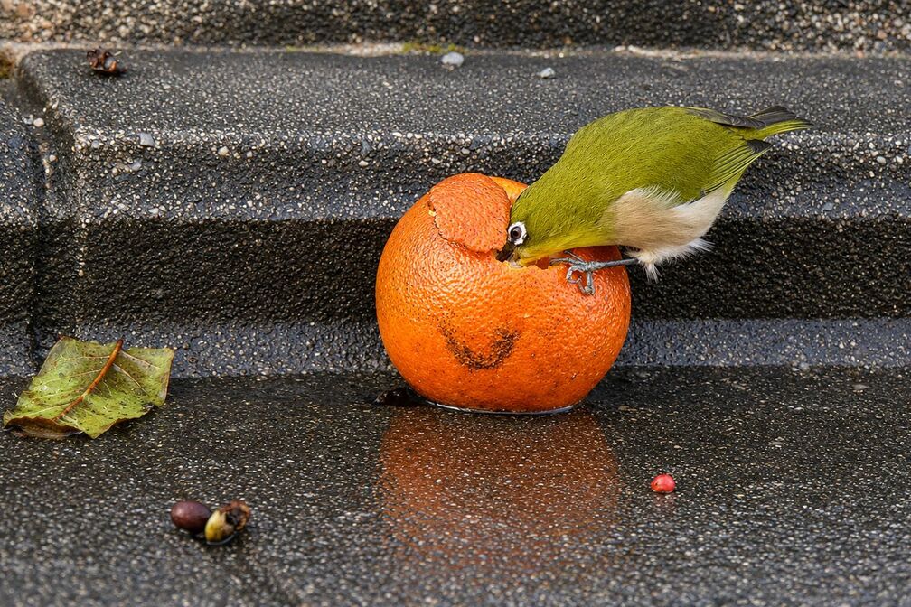
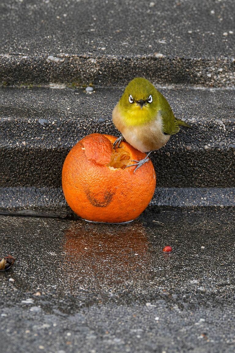
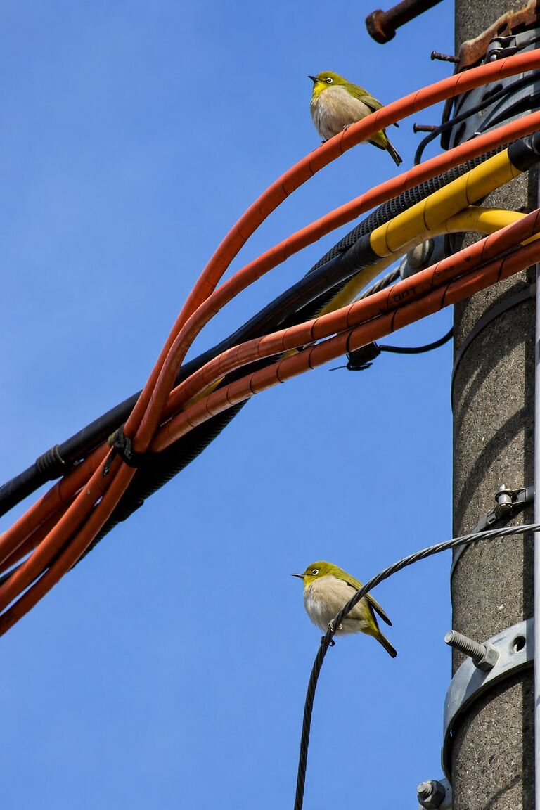
The logo keeps the composition of that moment: one small bird, on a mandarin.
The logo, then and now
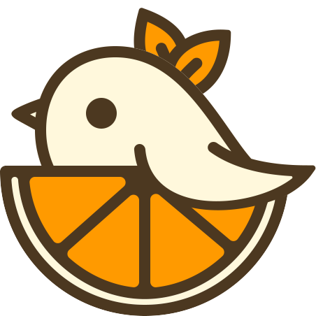
We had just settled on the name when we met that mejiro. The first logo came out of that encounter. In 2026 we redrew it: a softer line, less ornament. The chick has grown a little. So has the company.
Good things, made to last.